In real project development, besides UI libraries like Ant Design, you may also need build tools, routing solutions, CSS solutions, data flow solutions, request libraries and request solutions, i18n solutions, permission solutions, Icons solutions, etc. We have launched Umi, an enterprise application framework based on React, based on the scenarios of business scenarios, which we recommend you to use in your projects.
Umi is a scalable enterprise front-end application framework and the underlying front-end framework of Ant Group, which has served 10,000+ applications directly or indirectly.
This article will guide you through creating a simple application from scratch using Umi, Ant Design and Ant Design Pro.
The recommended way to create a Umi scaffold is using pnpm to execute the following command.
$ mkdir myapp && cd myapp$ pnpm create umi
If you use npm, you can run
npm create umifor the same effect; if you use yarn, runyarn create umi; if you use bun, which means you are a very hipster, you can runbunx create-umi(note that there is a-between create and umi).
Select "Simple App" here, because we want to start from "scratch".
? Pick Umi App Template › - Use arrow-keys. Return to submit.❯ Simple AppAnt Design ProVue Simple App
Here we recommend "pnpm". pnpm is better in speed and handling ghost dependencies.
? Pick Npm Client › - Use arrow-keys. Return to submit.npmcnpmtnpmyarn❯ pnpm
For those in China, we recommend choosing "taobao", otherwise choose "npm".
? Pick Npm Registry › - Use arrow-keys. Return to submit.❯ npmtaobao
The tool then automatically installs the dependencies and executes the initialization script for the umi.
Before starting the project, let's install some more dependencies that will be used in this tutorial.
$ pnpm i @umijs/plugins -D$ pnpm i antd axios @ant-design/pro-components -S
@umijs/plugins is the official plugin set of Umi, containing a large number of plugins such as valtio, react-query, styled-components, locale, access, qiankun, etc. antd needs no introduction. axios is the request library; @ant-design/pro-components is the component used to generate the layouts.
When finished, execute the following command to start the project.
$ npm run devumi devinfo - Umi v4.0.46╔════════════════════════════════════════════════════╗║ App listening at: ║║ > Local: http://localhost:8000 ║ready - ║ > Network: http://*********:8000 ║║ ║║ Now you can open browser with the above addresses↑ ║╚════════════════════════════════════════════════════╝
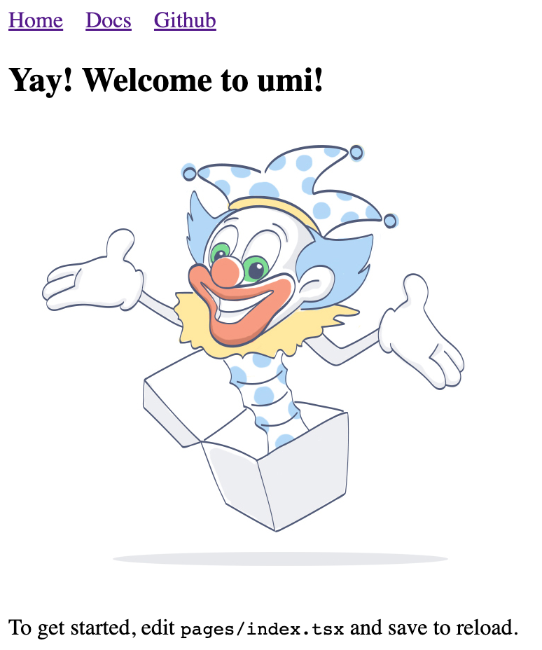
Follow the prompts and click the url in the command line, which will automatically open the browser. If it goes well, you will see the following screen.

We're going to write an application to display a list of products. The first step is to create the routes, which can be thought of as the different pages that make up the application. Umi users don't usually need to care about the implementation behind Umi, but in case you're wondering, Umi's routes are based on react-router@6.3 (Note: not the latest 6.4, which contains loader and action functionality that is not required for Umi).
We can create routes with cli.
$ npx umi g page productsWrite: src/pages/products.tsxWrite: src/pages/products.less
Then modify the configuration file .umirc.ts with the new route declaration.
import { defineConfig } from "umi";export default defineConfig({routes: [{ path: "/", component: "index" },{ path: "/docs", component: "docs" },+ { path: "/products", component: "products" },],npmClient: "pnpm",});
Since the boilerplate uses configured routing, as the name implies, the routes are configured line by line by people, which is tedious but more flexible, this way you need to add the routes field to the configuration, see Umi Documentation on Routing. In addition, Umi also supports protocol-based routing, meaning that the file system is the route, so there is no need to configure routes to take effect.
Then we edit the src/layouts/index.tsx file and add the navigation to the /products path in the global layout route.
<li><Link to="/docs">Docs</Link></li>+ <li>+ <Link to="/products">Products</Link>+ </li>
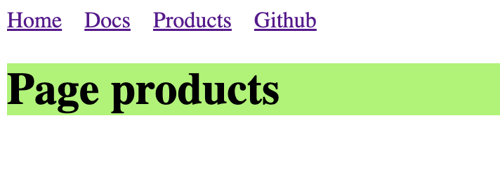
Open http://localhost:8000/products and if it goes well, you will see the following page.

As your application grows, you'll need to share UI elements across multiple pages (or use them multiple times on a single page), and in Umi you can abstract this out into components. Let's write a ProductList component so that we can display the product list in different places.
Create a new src/components/ProductList.tsx file with the following code.
import React from 'react';import { Button, Popconfirm, Table } from 'antd';import type { TableProps } from 'antd';interface DataType {id: string;name: string;}const ProductList: React.FC<{ products: DataType[]; onDelete: (id: string) => void }> = ({onDelete,products,}) => {const columns: TableProps<DataType>['columns'] = [{title: 'Name',dataIndex: 'name',},{title: 'Actions',render(text, record) {return (<Popconfirm title="Delete?" onConfirm={() => onDelete(record.id)}><Button>Delete</Button></Popconfirm>);},},];return <Table rowKey="id" dataSource={products} columns={columns} />;};export default ProductList;
Assuming we have agreed on an API interface with the backend developers, we can now use Mock data to locally mock up the data that the API should return, so that front-end and back-end development can proceed simultaneously without the front-end work being blocked because the back-end API is still being developed. Umi provides an out-of-the-box Mock function that allows you to set up Mock data in a convenient and easy way.
Create a new mock/products.ts file in the root directory with the following code.
import { defineMock } from 'umi';type Product = {id: string;name: string;};let products: Product[] = [{ id: '1', name: 'Umi' },{ id: '2', name: 'Ant Design' },{ id: '3', name: 'Ant Design Pro' },{ id: '4', name: 'Dva' },];export default defineMock({'GET /api/products': (_, res) => {res.send({status: 'ok',data: products,});},'DELETE /api/products/:id': (req, res) => {products = products.filter((item) => item.id !== req.params.id);res.send({ status: 'ok' });},});
Then visit http://localhost:8000/api/products and you will see the api response.
With the UI components and Mock data done, it's time to bring them together. The request solution is needed here, and our choice here is react-query (if you want to say @tanstack/react-query, yes, they are the same library, and @tanstack/react-query is a renamed package of react-query). So before you start, you need to change the configuration to enable the react-query plugin for Umi with one click.
First edit .umirc.ts.
import { defineConfig } from "umi";export default defineConfig({+ plugins: ['@umijs/plugins/dist/react-query'],+ reactQuery: {},routes: [{ path: "/", component: "index" },{ path: "/docs", component: "docs" },{ path: "/products", component: "products" },],npmClient: 'pnpm',});
Edit src/pages/products.tsx with the following code.
import React from 'react';import axios from 'axios';import { useMutation, useQuery, useQueryClient } from 'umi';import styles from './products.less';import ProductList from '@/components/ProductList';export default function Page() {const queryClient = useQueryClient();const productsQuery = useQuery(['products'], {queryFn() {return axios.get('/api/products').then((res) => res.data);},});const productsDeleteMutation = useMutation({mutationFn(id: string) {return axios.delete(`/api/products/${id}`);},onSettled: () => {queryClient.invalidateQueries({ queryKey: ['products'] });},});if (productsQuery.isLoading) {return null;}return (<div><h1 className={styles.title}>Page products</h1><ProductListproducts={productsQuery.data.data}onDelete={(id) => {productsDeleteMutation.mutate(id);}}/></div>);}
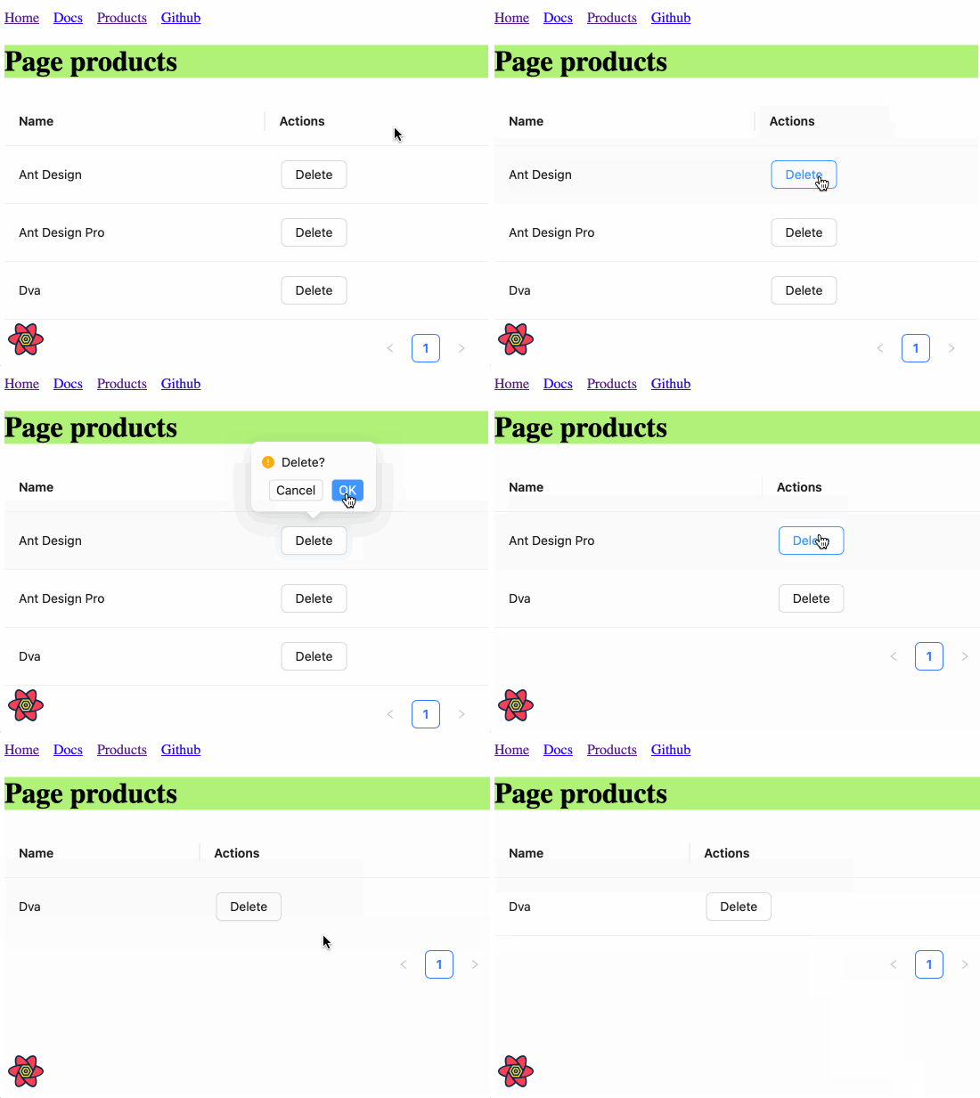
Here, we pull the data from /api/products with useQuery() and submit a DELETE request to /api/products/${id} in the onDelete event with useMutation() to perform the delete operation. For more details on the use of react-query, please refer to Umi Plugin for React Query and React Query Official Website.
After saving, you should see the following screen.

A standard backend project generally need a layout, this layout is very often highly similar, ProLayout encapsulates the common menu, breadcrumbs, page headers and other functions, provides a non-dependent framework and an out-of-the-box advanced layout component. And support side, mix, top three modes, but also built-in menu selection, menu generation breadcrumbs, automatically set the logic of the page title.
Modify the configuration for each route to add a name field for ProLayout to do menu rendering use.
import { defineConfig } from "umi";export default defineConfig({routes: [- { path: "/", component: "index" },+ { path: "/", component: "index", name: "home" },- { path: "/docs", component: "docs" },+ { path: "/docs", component: "docs", name: "docs" },- { path: "/products", component: "products" },+ { path: "/products", component: "products", name: "products" },],plugins: ["@umijs/plugins/dist/react-query"],reactQuery: {},npmClient: "pnpm",});
Edit src/layouts/index.tsx with the following code.
import { ProLayout } from '@ant-design/pro-components';import { Link, Outlet, useAppData, useLocation } from 'umi';export default function Layout() {const { clientRoutes } = useAppData();const location = useLocation();return (<ProLayoutroute={clientRoutes[0]}location={location}title="Umi x Ant Design"menuItemRender={(menuItemProps, defaultDom) => {if (menuItemProps.isUrl || menuItemProps.children) {return defaultDom;}if (menuItemProps.path && location.pathname !== menuItemProps.path) {return (<Link to={menuItemProps.path} target={menuItemProps.target}>{defaultDom}</Link>);}return defaultDom;}}><Outlet /></ProLayout>);}
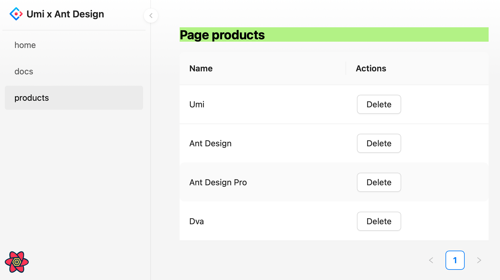
Here we first use umi's useAppData to get the global client route clientRoutes, which is a nested routing object, and we pass clientRoutes[0] to ProLayout; then we use useLocation() to get the location information, which is also passed to ProLayout to decide which menu should be highlighted; we also want to do a route jump when we click on the menu, so we need to customize ProLayout's menuItemRender method.
You may have found src/layouts/index.less has no place to refer to him, in order to keep the project file tidy, you can choose to delete him.
The browser will automatically refresh at this point, and if it goes well, you'll see the following screen.

After completing the development and verifying it in the development environment, it is time to deploy it to our users by executing the following command.
$ npm run buildinfo - Umi v4.0.46✔ WebpackCompiled successfully in 5.31sinfo - File sizes after gzip:122.45 kB dist/umi.js575 B dist/src__pages__products.async.js312 B dist/src__pages__index.async.js291 B dist/layouts__index.async.js100 B dist/layouts__index.chunk.css55 B dist/src__pages__products.chunk.cssevent - Build index.html
The build command will package all resources, including JavaScript, CSS, Web Fonts, images, Html, etc. You can find these files in the dist/ directory.
We have completed a simple application and you may still have many questions, such as
You can.